|
Angelic Designs for the Undead |
|
|
|
Continued from previous page... STYLE AND INFLUENCE
A contemporary designer came into an existing rooftop and installed this hip environment for these people," Andrew says. Angel offers many unique guidelines when establishing a design. "Usually on our show, because it's a lot about pretty people beating the crap out of one another, it's about a fight. That's the major sort of parameter that really controls what we do. If for example, Angel is going to be flipping around and he's going to be taking on five guys, our environment has to be flexible enough to support that. Whereas, a show like Law and Order, where the detectives might run around a little bit and chase somebody, they're not going to have the same sort of constraints that we do. Our show is actually deceptive. It's very difficult because there is a whole stunt aspect to what we do. It has to function for these fights. There are special effects that get involved, a lot of CG [computer graphics] work." Likewise, as Stuart also remarked, the factor of time is always an issue. "The idea of an eight-day shoot on an episodic television show, you have to function incredibly quickly in terms of what you do. You have to arrive at the idea yesterday and then you have to convey it in the form of drawings and models to people who are going to be building it. It has to all happen within days whereas in architecture it's about sort of developing over time and it takes months and years sometimes to construct a building. Whereas what we do, it happens almost literally over night in many cases."
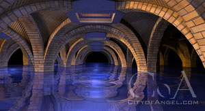
Angel presents designers with an array of unique sets. The most prominent of these are obvious: The Hyperion, Wolfram & Hart, Caritas - but it is the more subtle episodes that often present the more exciting challenges. For Andrew, Season Four's Sky Bar is a set that he is particularly fond of. "That was one where a lot of the shapes and proportions I have been trying to get made for a long time and it's rare that you actually have a chance to explore that kind of geometry. I think the one recently that we did, the industrial basement that just shot about a week ago, was an example of a rectangle with just stock walls but we came up with an idea of these sort of sweeping arches. The thing that inspired that actually, I was watching the film Signs. I was watching the way M. Night [Shyamalan] sets up a shot. It's all about frames. It's classic [Alfred] Hitchcock. It's frames within frames within frames. You get that depth that you are always after in what we do." Waiting in the Wings is a prime example of this, where Angel and Cordelia go below the stage into the dressing rooms and they seem to extend off forever. "The last thing any designer wants to have on television or on the big screen is flatness. You never want characters just against skim coated walls. You're always striving to create, in a theatrical way, the proscenium arch, and you create the illusion of depth; that there is a world outside of what's happening. Because we're limited by time and money, it was an example of creating these elements that could function within what was already there and allow the opportunity for a director to come in and say, 'That's great. We can bracket this, we can create this frame.'"
Besides drawing influence from modern film, Andrew also strives to borrow a good amount from the time tested, classical architectural styles. "It also stems from an artist in the 18th century, Piranesi, an Italian illustrator who illustrated a lot of the ancient Roman ruins. This is something that I fall back on a lot because we do these underground spaces. They're very dark, they're cavernous, and if you look at Piranesi's sketches from the Carceri series which was about prisons, it's very dark, it's very negative. They're incredible illustrations the way he always sets it up. Typically in the foreground there is a hint of an arch. It's very simple, it's just a sweeping segment and that gives you a foreground element by which you're then looking through to a world that you hopefully would never want to be in, but it's still just cool. It's just incredibly cool," he continues. "Those are the kind of basic graphic principles that I try to grab on to. Of course we never get a chance to really get into the carved stone, beautiful period motifs. We can build anything here at Paramount except that we're so limited in television by time and money. But it's at least the right idea." Even though Angel has taken an incredible new turn this season, Andrew's job has remained largely unaltered. In fact, the emergence of the Wolfram & Hart set has allowed him to confront certain issues he had with the Hyperion. "We'll design anything we're asked to. It was actually pleasurable to get the nod toward Wolfram & Hart for the redesign of the basic sets because there were a lot of things about the old art deco lobby for the hotel that, for me, were really unfortunate. We were so crunched for time, I had come from features where I was used to a lot more time to lay things out and this was the first time that I'd ever had a chance to work on a series like this. You kind of have to be like Kobe [Bryant] in the sense that you're going to take over the game, you've got a simple sketch and you've got to make it happen," Andrew illustrates. "We're a very small department. It's easy for people to get spread over different challenges and obligations so it means a lot gets thrown at you and you've got to come up with the response and just lay it out quickly. So there were a lot of things we did right about that first hotel and there were a lot of things, in my mind, that we did wrong. It was nice to sort of get a second chance and a completely different period."
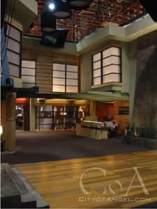
Wolfram & Hart also allowed Andrew to explore an entirely different architectural style. "It's present day, it's contemporary, it's sleek. You don't have a chance to think about the way Frank Gehry might approach this thing because we don't have the budget to attack compound angles on this show. It's going to be much more Asian, it's going to be much more about someone like Charles Ray Eames. Simple shapes, proportions, space light and form: it was very Japanese in the approach. It was about transparent planes and space overlapping grids, very simple grids. I had maybe two or three weeks to draw that thing out, which is not a lot of time single handedly, and then about thirty carpenters had to decipher the drawings and be able to understand them. So what could I do to come up with a very simple proportional system that they could just almost mass produce? All those store fronts and windows are based on the same module." The end result is a set that was relatively simple to build and that achieves the Art Department's goals when it is filmed. "Once they had that it was almost like a jig that they could set up. They could mass produce those things, it made it very quick for them to fabricate and then install. Then there were a few choice moments: there was the angled wall of the elevator that lit up and we did a really nice smooth trowel plaster finish over that, very contemporary. Then we also had the swooping canopy over the air foil or aerodynamic shape that is over the reception counter. Those were the kind of choice elements within an overall system of repetition that was simple yet elegant. It also worked with camera in the sense of all that transparency set up the depth that I was talking about earlier." |