Icon Tutorial #1
So how did I go from this pic to
this icon?
First I made the image 1 step sharper to get the focus back after resizing the image
(be sure to not overuse this effect, then it will look very bad and not very appealing)
![]()
Then I duplicated the 'tara' layer 3 times, and set them all to screen. You might wonder
why I did this. Well, it lightens up your image but you don't have to rely on "brightness/contrast" or "curve", so
if it ends up just too light when you've added textures or gradients, just remove one or two
of these screen layers and you're ok :)
![]()
I then added a border with one of the icon-border brushes by http://www.oxoniensis-art.net/. I then flipped it horizontally, because
I just thought it looked better that way.
![]()
Then I added a gradient, can't remember who's it is but I didn't make it myself.
I set it to soft light to give the icon a little warmth from the red color in it.
![]()
![]()
I then added an icon texture by http://www.oxoniensis-art.net/ to get a little darker effect,
and to get the red in the background dimmed down on the edges and also give some "painting" feel
to the icon. I changed the opacity to color burn to bring out the effects in it and to not override
the icon itself.
![]()
![]() When I was done, I ended up with this icon
When I was done, I ended up with this icon
As you can see, not very hard. ;) Good luck with your own icons, and remember, just because
my icon turned into this color doesn't mean yours will, it all depends on the original picture
used to make the icon.
Graphics
Recent Additions
Alias
Angel
Btvs
Firefly
Gilmore Girls
Lost
The O.C
Tru Calling
Veronica Mars
Crossovers
Misc
Icons - Currently offline
Bookmarks
Downloads
Gallery
Textures
Free Layouts
Photoshop Tutorials
HTML / CSS Tutorials
Screencaptures
Angel
Buffy
Firefly
Serenity
Site | www
Contact
Gifts
Awards
SOTM
Affiliates
Links
Link Chosen Art
Domain
Profile: Dana
Updates
Disclaimer
Main
Statistics
Webmistress: Dana
CA DOB: June 2004
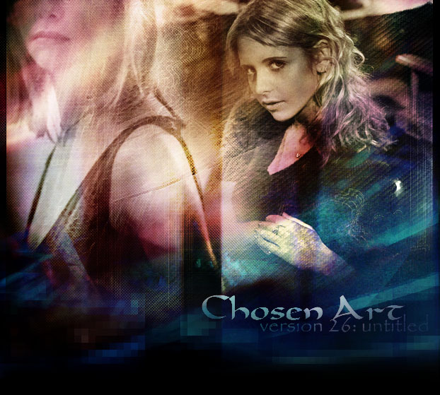
Layout Version: 26
Fanatics: 56073
Link Here


more?
Affiliates

more?
HQ Pictures

Tagboard
Recent Additions
Alias
Angel
Btvs
Firefly
Gilmore Girls
Lost
The O.C
Tru Calling
Veronica Mars
Crossovers
Misc
Icons - Currently offline
Bookmarks
Downloads
Gallery
Textures
Free Layouts
Photoshop Tutorials
HTML / CSS Tutorials
Screencaptures
Angel
Buffy
Firefly
Serenity
Site | www
Contact
Gifts
Awards
SOTM
Affiliates
Links
Link Chosen Art
Domain
Profile: Dana
Updates
Disclaimer
Main
Statistics
Webmistress: Dana
CA DOB: June 2004
Layout Version: 26
Fanatics: 56073
Link Here
more?
Affiliates
more?
HQ Pictures
Tagboard